
home page | data viz examples | critique by design | final project I | final project II | final project III
View the full draft Shorthand story here: From Home to Here
Building on the five chapter sketches from Part I, this section develops the story further with high fidelity draft data visualizations for the critical chapters. The two visualizations below represent the most data-driven moments in the story - the cost shock in Chapter 2 and the call to action in Chapter 5. The remaining chapters rely on the refined sketches from Part I as storyboard references while the full Shorthand draft continues to be developed.
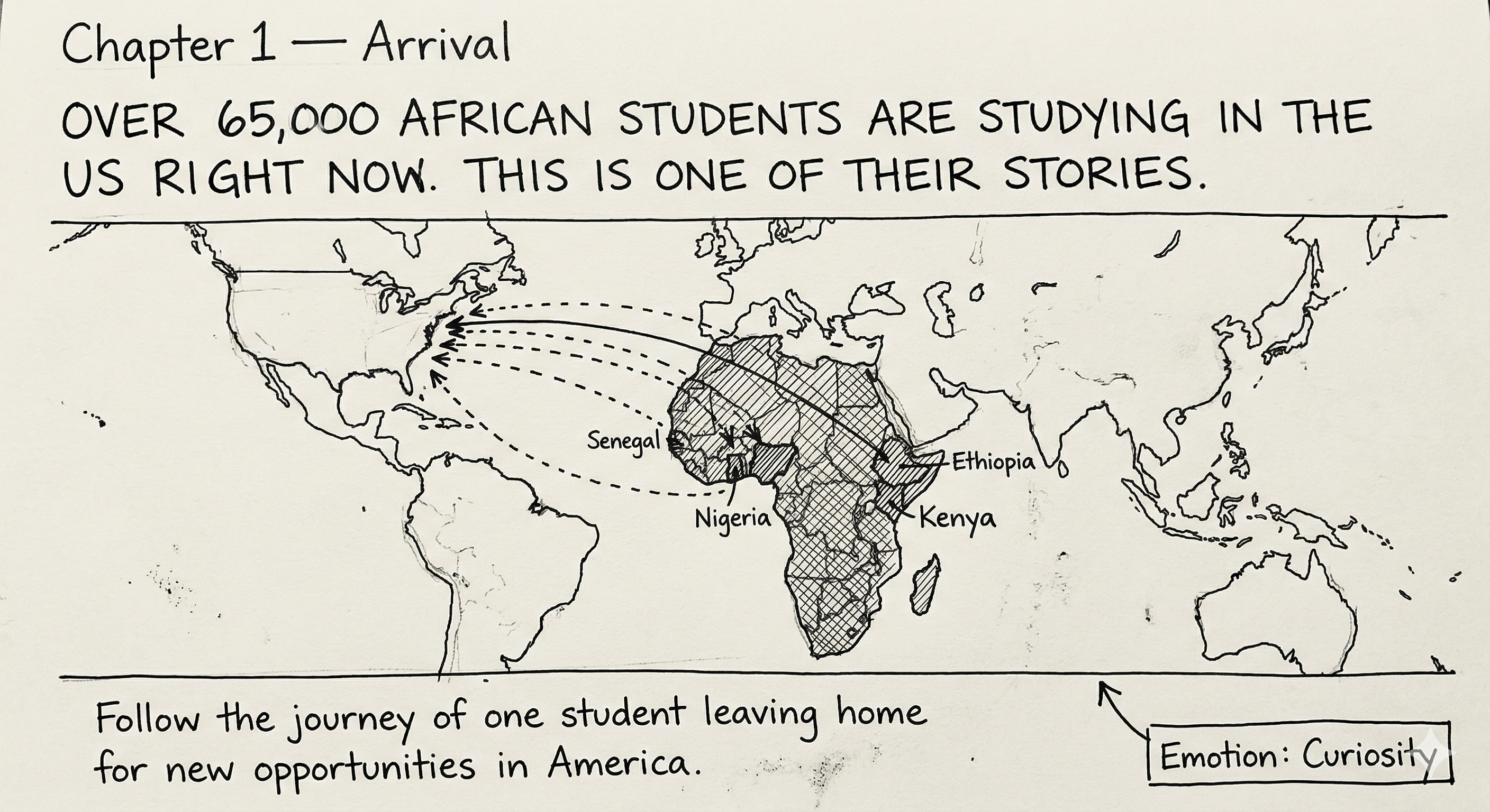
Storyboard sketch showing a world map with African student origin countries and dashed lines pointing toward the US. Over 65,000 students from sub-Saharan Africa are currently studying in the US, with Kenya ranking third among sending countries.
This is the first data visualization built in Datawrapper using real Numbeo price comparison data between the US and Kenya. The chart shows how everyday groceries cost 3 to 7 times more in the US than in Kenya.
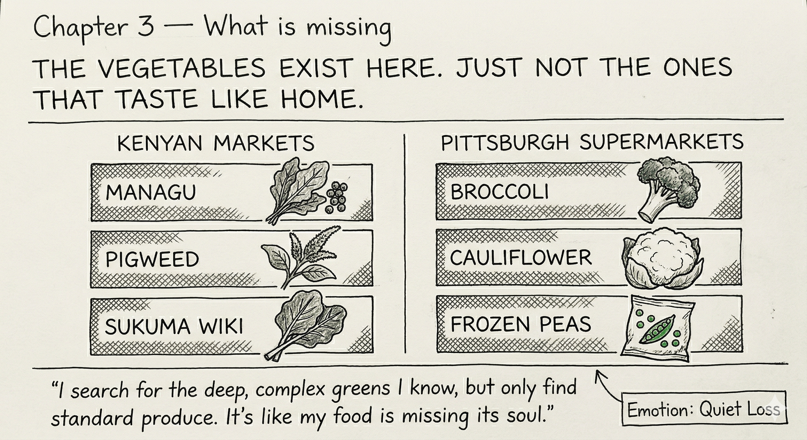
Storyboard sketch showing a side by side comparison of vegetables available in Kenyan markets versus Pittsburgh supermarkets. The left column shows managu, pigweed and sukuma wiki. The right column shows broccoli, cauliflower and frozen peas.
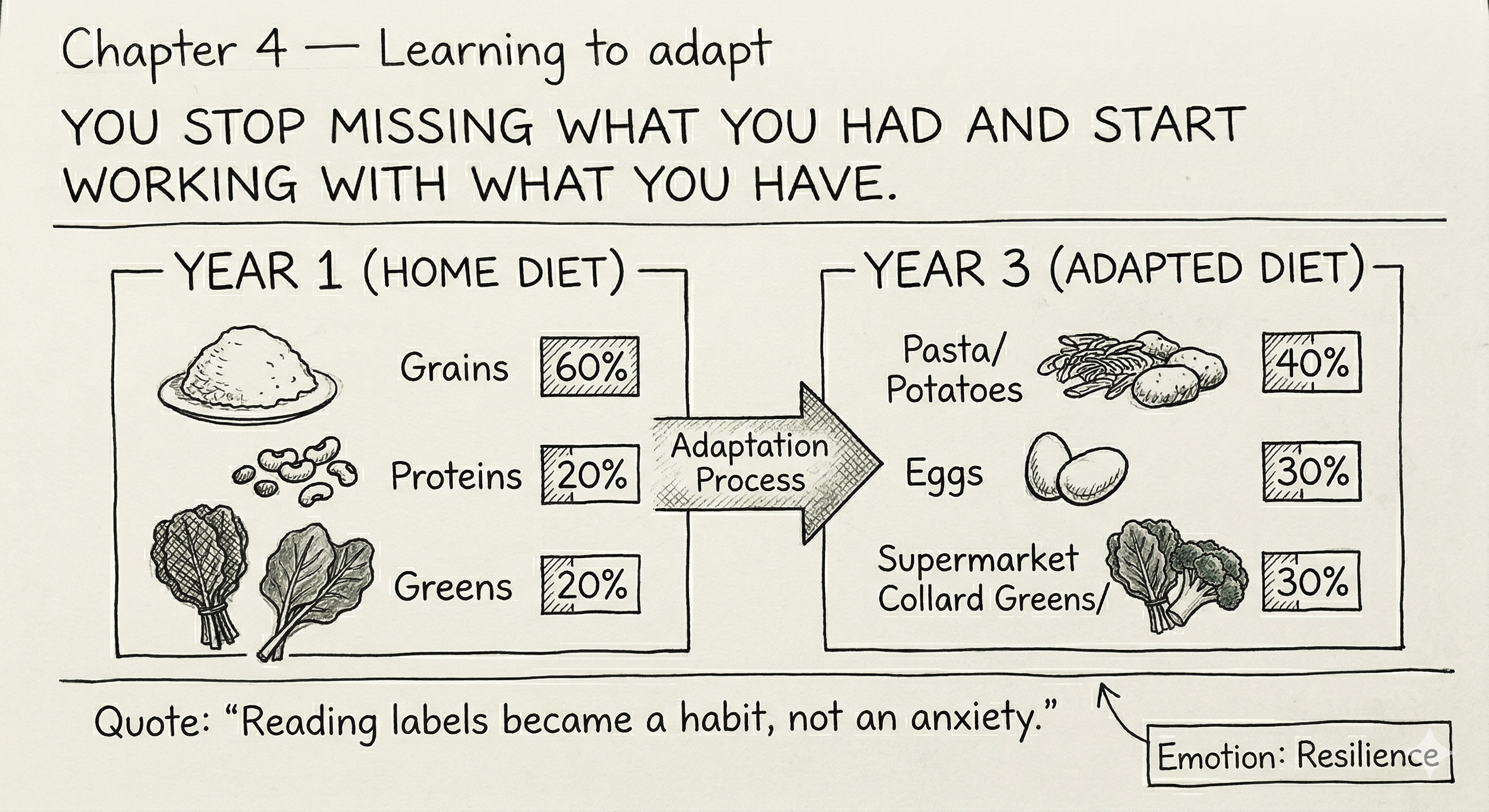
Storyboard sketch showing a before and after comparison of diet composition - from arrival to adaptation - with food categories and percentages showing how habits shift over time.
This is the second data visualization built in Datawrapper using peer-reviewed research data. It shows that first year international students face nearly double the food insecurity rate of students who have been in the country longer.

The primary audience for this project is university administrators responsible for international student support, dining services and campus inclusion programs. The goal is to help them understand what African students go through around food when they first arrive and what small changes universities could make to help.
To test whether the story and visualizations were landing clearly, I gathered feedback in two rounds. The first was informal in-class peer critique during the storyboard development session. The second was a set of structured one-on-one interviews I conducted with four friends in person.
During the in-class critique session I shared my five chapter sketches with peers and received the following feedback:
This feedback directly shaped the decisions I made going into the structured interviews and into building the Shorthand draft.
I interviewed four friends in person - two female and two male, all in their early to mid twenties. None of them knew anything about the project beforehand. I showed them the five chapter sketches from Part I without any explanation first, then worked through the questions below with each person.
| Goal | Questions asked |
|---|---|
| Understand if the overall message is clear | Just looking at this, what do you think this project is about? Who do you think this story is for? |
| Test each chapter individually | Walk me through what you see in each sketch. |
| Identify confusion or gaps | Is there anything that confuses you? Which sketch is the least clear and why? |
| Identify what is working | Which sketch is the clearest and why? |
| Test story structure | Does the story feel complete - beginning, middle and end? |
| Identify missing content | What would you want to know more about? |
| Test the call to action | Does the call to action feel convincing - would a university administrator act on this? |
| Question | Interviewee 1 - female student, early 20s | Interviewee 2 - female student, mid 20s | Interviewee 3 - male student, mid 20s | Interviewee 4 - male student, early 20s |
|---|---|---|---|---|
| What is this project about? | "Finding how to help international students settle in when it comes to food" | "International students and life abroad" | "Local policies to international students, showing what is available so they are not surprised" | "Speaking for students going abroad, what they hope and realize" |
| Who is it for? | International students | "International students, mostly Kenyans" | Universities and international students directly | Africans |
| Walk through each sketch | Ch1 migration feel, Ch2 huge price differences, Ch3 supermarkets don't have same foods, Ch4 someone can eventually adapt, Ch5 "identification of a concrete issue" | Ch1 background info on students moving, Ch2 cost shock, Ch3 about missing foods, Ch4 confused about home diet and adaptation, Ch5 food insecurities and transition | Ch1 basic stats of students in US, Ch2 "cost comparison especially chicken and greens, the labels are good", Ch3 unsure if side by side is same vegetable in two places or different vegetables, Ch4 shows resilience but doesn't understand the quote on the chart, Ch5 affirms universities as audience | Ch1 many people curious to travel in large numbers, Ch2 shock of prices, Ch3 same food but different tastes, Ch4 understands diet change, Ch5 "shows adaptation levels and struggles over years" |
| What confuses you? | "Chapter 5 needs clearer reading, the numbers are vague at first glance" | "Chapter 4 - not sure what is happening in either panel" | "Chapter 3 - I wasn't sure if the side by side was showing the same vegetable in two different places or two completely different vegetables." Chapter 5 - "does the 43% drop to 22% or are these two separate groups?" | Chapter 1 - "do the dashed and solid arrows mean something different?" |
| Which sketch is clearest? | "Chapter 2 - the distinction is clear especially with the icons" | Did not specify | "Chapter 2 - shows difference in prices, labels are good" | Chapter 5 - "shows specific percentages" (spent the most time going through all the sketches before answering) |
| Which is least clear? | Chapter 5 - same reasons as above | Chapter 4 - same confusion | Chapter 3 - same reasons as above | Chapter 1 - arrow distinction |
| Does the story feel complete? | "Yes, it ties all the illustrations together and puts focus on the issue" | "Yes, it has a beginning, middle and end, and concludes with findings" | Yes | "Yes, there is flow" |
| What would you want to know more about? | More about the issue and how it can be resolved | More proposed solutions - "the sketches just show the situation and reality" | "Why aren't there more culturally diverse food options - is it money or availability?" | "After the struggles and adaptation, how was the process and what can others know from it?" |
| Does the call to action convince? | Yes | Yes - suggests adding more solutions, for example "events to promote cultural food sponsorship" | "Chapter 5 needs to be more detailed - explain more of the how and why" | "Universities should be involved from both ends, for example exchange programs collaborating to provide financial aid" |
Where interviewees agreed: All four understood the overall topic without any prompting and all four said the story felt complete with a clear beginning, middle and end. Chapter 2 was identified as the clearest sketch by three out of four, with the bar chart format and food icons consistently praised. Three out of four wanted more detail on solutions and the how and why behind the call to action.
Where interviewees differed: There was no agreement on who the story is for. Two said universities or administrators, one said international students generally, and one said Africans. This was the most inconsistent finding and suggests the institutional audience needs to be made clearer earlier in the story. On the question of which sketch was least clear, different chapters were flagged by different people - Chapter 5 by one person, Chapter 4 by one person, Chapter 3 by one person and Chapter 1 by one person - suggesting no single chapter was universally confusing, but each had at least one reader who struggled with it.
| Research finding | Planned change for Part III |
|---|---|
| Two people were unsure whether the Chapter 3 side by side showed the same vegetable in two locations or two different vegetables | Add a clear subtitle to Chapter 3 stating that the left column shows what is available in Kenyan markets and the right column shows what is available in Pittsburgh supermarkets |
| Two people found Chapter 4 confusing, especially the quote sitting inside the chart | Move the quote below the visualization as supporting text. Add a clearer transition label between the before and after panels so the direction of change is obvious on first read |
| Three people were unsure whether 43% and 22% in Chapter 5 represent the same group over time or two different groups | Add one explanatory sentence clarifying these are two separate groups - first year international students versus those who have been in the country longer. Now addressed in the published Datawrapper visualization |
| Three people wanted more detail on solutions and the how and why behind the call to action | Expand the recommendations in Chapter 5 with more specific and actionable suggestions for university administrators. Now addressed in the Shorthand draft with three numbered recommendations referencing the CMU food pantry specifically |
| One person asked about the dashed versus solid arrows in Chapter 1 | Add a label or note clarifying what the arrow distinction represents so it reads as intentional. Also considering building a proper interactive map visualization to replace the sketch entirely |
| Two people identified the audience as international students rather than university administrators | Reframe the headline and opening text of Chapter 5 to address university administrators directly so the intended audience is clear from the first line |
| In-class peers flagged the bar chart colors as clashing and inaccessible for colorblind readers | Colors updated from blue and green to teal and amber across both Datawrapper charts. This change has already been implemented |
| In-class peers noticed the loss of food icons when moving from sketch to Datawrapper chart | Explore options for adding visual interest to Chapter 3 in Part III, either through a designed graphic or a Shorthand layout that allows more visual control than a standard chart |
Claude (Anthropic) was used to support organising interview findings and drafting the changes planned for Part III. All interview notes, observations and design decisions are my own. Claude was used as a thinking tool, not as a replacement for my own work.
Shorthand AI companion was used to help generate initial layout suggestions for the Shorthand story. I provided detailed briefs for each chapter specifying the heading, emotional tone, visualization type and the specific details of my personal experience. The AI generated draft text which I then edited extensively in my own voice. All narrative decisions, personal reflections, structural and image choices were my own.
Google Gemini was used in Part I to generate the initial sketches referenced in the storyboard section above. The briefs were revised a few times before landing on the final versions. All creative and narrative decisions behind the sketches were my own.
Datawrapper was used to build the two data visualizations embedded on this page.
home page | data viz examples | critique by design | final project I | final project II | final project III