home page | data viz examples | critique by design | final project I | final project II | final project III
I arrived in the United States in January 2026, flying in from Kigali, Rwanda, where I am completing my final semester of a Masters in Information Technology at CMU Africa. I am originally from Kenya. My first "real" meal here was at a Mexican restaurant where I ordered enchiladas. I had heard they were good but my tongue disagreed. It was not that the food was bad, it just did not connect with anything I was used to. Back home in Kenya, food is fresh, affordable and easy to come by. I am a picky eater who loves a good meal, which is probably why I taught myself to cook. Meat tastes the way meat should taste. Vegetables are fresh and local. Food at home just makes sense to you, you know how to work with it and you rarely have to think twice about it.
One of the first things I noticed here is how processed and sugary most food is, something even many Americans themselves acknowledge. For an African student, the American diet can feel quite exotic and it takes real time to adjust. This project is aimed at university administrators who work with international students. The goal is to help them understand that when African students struggle with food here, it is not a rejection of American culture. Some people simply do not adapt easily to a completely different diet and that is a normal human response. Through data on food costs, dietary changes and the lived experiences of international students, this project tells the story of how African students navigate food in the US, what they lose, what they discover and how they adapt over time. CMU has a wide variety of food options reflecting its diverse student population, but there is a visible gap when it comes to African food. This project makes the case that small intentional steps, such as making certain staple ingredients more accessible during the settling-in period, can go a long way in supporting students through one of the quieter but very real challenges of studying far from home.
One sentence summary: Food stops being invisible the moment you leave home, and what a Kenyan student discovers in an American kitchen reveals more about identity and adaptation than any meal ever did before.
Reader statement: As a university administrator, I want to understand how African students experience food and cultural disconnection so that I can make better decisions about how to support them during their first year on campus.
This project follows a five-chapter story structure built around the emotional journey of a Kenyan student navigating food in the United States. The story arc begins with curiosity and openness, drops at the point of loss and unfamiliarity, then gradually rises through adaptation and ends at a place of new awareness - higher than where it started, but changed.
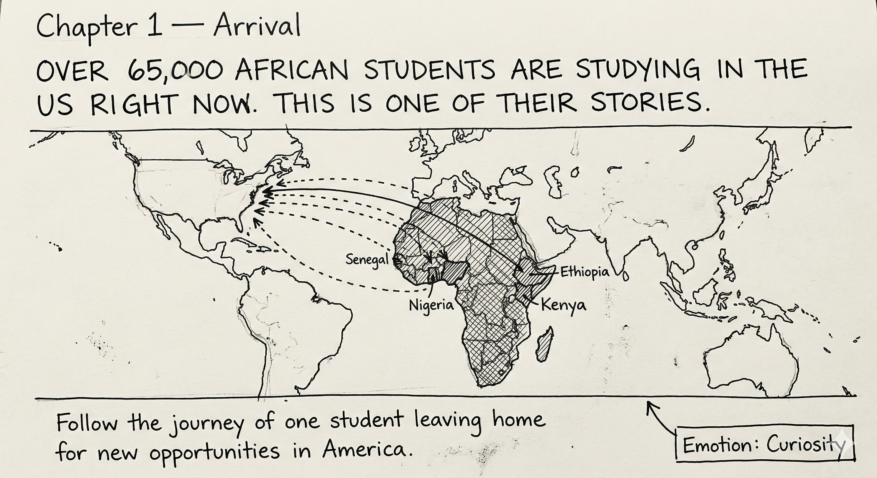
Chapter 1: Arrival
Emotion - curiosity and openness
The story opens by establishing who African students in the US are and where they come from. Using IIE Open Doors enrollment data, this section shows the scale of the population - over 65,000 students from sub-Saharan Africa currently studying in the US, with Kenya ranking third among sending countries. The visualization here is a map of origin countries. This is not one person's story, it is a pattern.
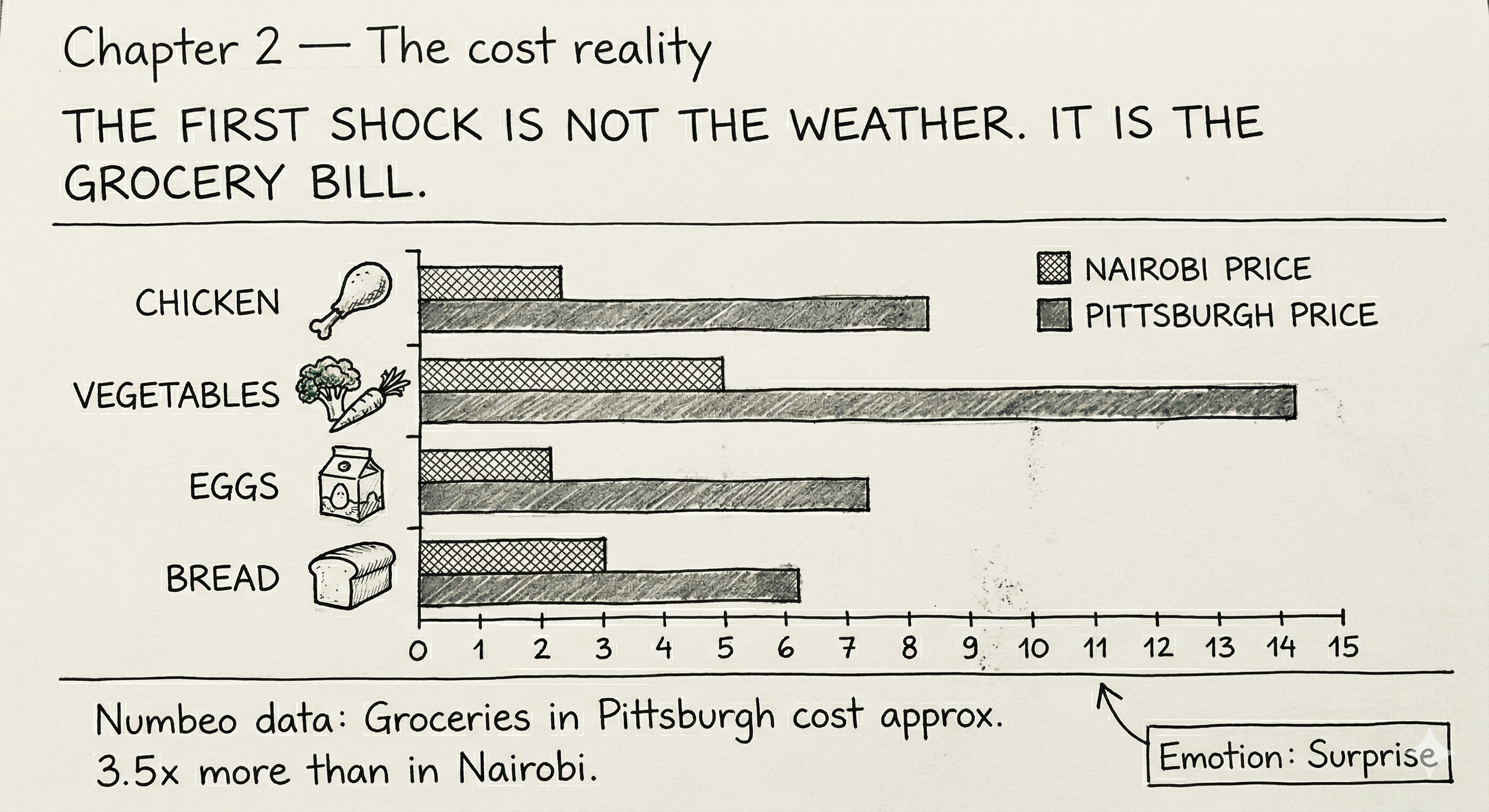
Chapter 2: The cost reality
Emotion - surprise
The reader encounters the first real shock - how much food costs here compared to home. Using Numbeo data comparing Nairobi and Pittsburgh, this section visualizes the price difference for everyday food items side by side. The visualization is a bar chart showing cost comparisons across familiar food categories.
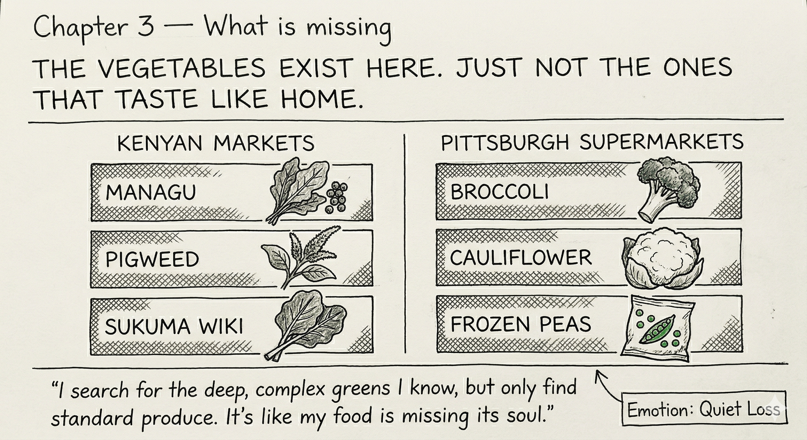
Chapter 3: What is missing
Emotion - quiet loss
This is the emotional low point of the story. The foods that feel like home - fresh vegetables such as kale, managu and other traditional greens, are either unavailable or unrecognizable here. Using FAOSTAT and Our World in Data vegetable consumption figures comparing Kenya and the US, this section shows how different the food supply actually is between the two countries. A short personal testimony anchors the data to lived experience.
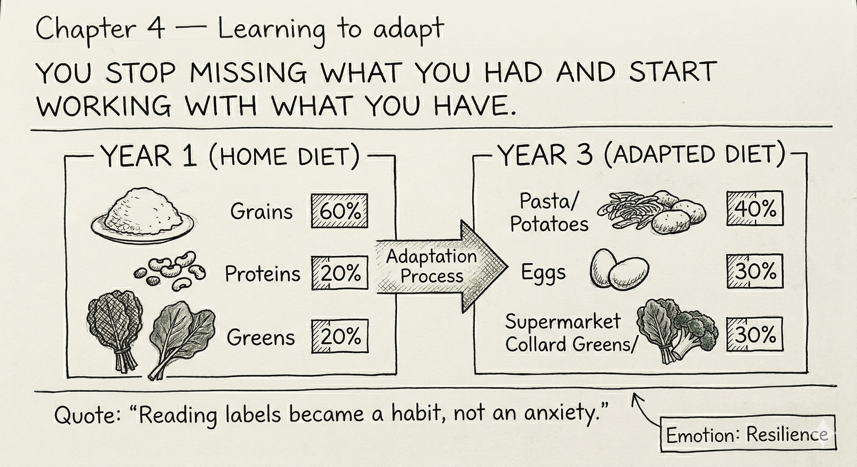
Chapter 4: Learning to adapt
Emotion - resilience
The story turns here. Students cook at home, read labels, find substitutes and slowly build new habits. Research on dietary acculturation among international students supports this section. This is also where the calorie label observation lives - the realization that labels exist because they need to, and that understanding them is a form of adaptation. The visualization shows how diet shifts over time.
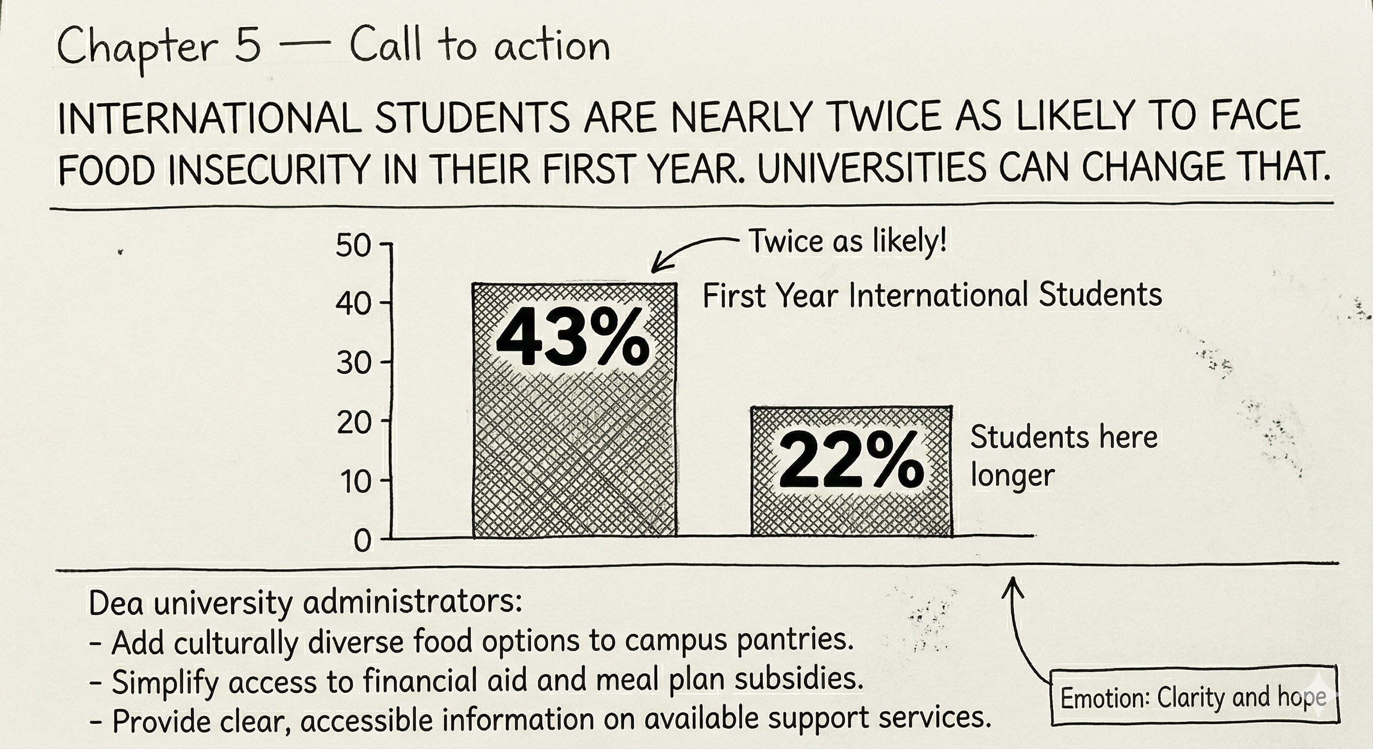
Chapter 5: Call to action
Emotion - clarity and hope
The story ends with a direct message to university administrators. International students face significantly higher food insecurity rates in their first year than domestic students. CMU has diverse food options but no African food presence. The visualization is a bold statistic paired with a clear and specific recommendation for how universities can do better.
The following sketches show the anticipated layout of the Shorthand story, one panel per chapter. Each sketch shows the section headline, the emotional tone and the type of visualization planned. Sketches were generated using Google Gemini (Google, 2026, gemini.google.com) based on detailed written briefs I developed for each chapter, specifying the headline, emotion, visualization type and layout for each panel. The briefs were revised a few times before landing on the final versions you see here.
Chapter 1 - Arrival
Chapter 2 - The cost reality
Chapter 3 - What is missing
Chapter 4 - Learning to adapt
Chapter 5 - Call to action
This project uses a mix of publicly available datasets and peer-reviewed research, each mapped to a specific chapter of the story. The data sources range from international enrollment statistics and food cost comparisons to peer-reviewed studies on dietary change and food insecurity among international students.
For the cost chapter, Numbeo provides item-level grocery price comparisons between Nairobi and Pittsburgh, which will be used to build a bar chart visualization. For the vegetable and cultural food chapter, Our World in Data and FAOSTAT provide country-level vegetable supply data that allows a direct Kenya versus US comparison over time. For the adaptation and call to action chapters, peer-reviewed studies from PubMed Central document how international student diets shift after arrival and confirm that food insecurity rates among first-year international students are significantly higher than among domestic students.
| Chapter | Source | Link |
|---|---|---|
| Chapter 1 - Arrival | IIE Open Doors 2025 - international student enrollment data | opendoorsdata.org |
| Chapter 2 - Cost reality | Numbeo - food price comparison, Nairobi vs Pittsburgh | numbeo.com |
| Chapter 2 - Cost reality | USDA Food Price Outlook - US food price data by category | ers.usda.gov |
| Chapter 3 - What is missing | Our World in Data - vegetable consumption per capita (Kenya vs US) | ourworldindata.org |
| Chapter 3 - What is missing | FAOSTAT - UN food balance sheet data by country | fao.org |
| Chapter 4 - Adaptation | PMC - eating habits and dietary change among international students | pmc.ncbi.nlm.nih.gov |
| Chapter 4 - Adaptation | PMC - dietary acculturation among international students | pmc.ncbi.nlm.nih.gov |
| Chapter 5 - Call to action | CDC - added sugar consumption data among American adults | cdc.gov |
| Chapter 5 - Call to action | PMC - food insecurity rates among international vs domestic students | pmc.ncbi.nlm.nih.gov |
| Chapter 5 - Call to action | PMC - food insecurity among first year international students | pmc.ncbi.nlm.nih.gov |
This project will be built using Shorthand as the primary storytelling platform, allowing the story to unfold as a scrollable, interactive web experience. Data visualizations will be created in Datawrapper and embedded directly into the Shorthand story at each relevant chapter.
Claude (Anthropic) was used throughout the development of this project outline to support brainstorming, structuring the narrative arc, identifying and verifying publicly accessible data sources, and drafting written sections. All content reflects my own experiences, decisions and voice. AI was used as a thinking and drafting tool, not as a replacement for original thought or personal reflection.
Google Gemini was used to generate the initial sketches for each chapter based on detailed written briefs I developed for each section. The briefs specified the headline, emotional tone, visualization type and layout for each panel. Gemini translated these briefs into visual sketches. All creative and narrative decisions behind the sketches were my own.
home page | data viz examples | critique by design | final project I | final project II | final project III